Despite my last post being mainly about vibrant colours and trying new painting techniques I made the mistake today of picking up the Tau codex. When I started playing 40k (back in 2003) my first army was Tau and I have a real soft spot for the heavily armed peaceniks. So it was I found myself scribbling an army list from the Codex Tau Empire, not one that I think will perform amazingly well but one I had a few ideas over how to paint and model.
The force:-
HQ
Shas'el with missile pod (twin linked), shield drone and iridium armour. 103pts
Troops
8 man Firewarrior team with team leader. 90pts (5 of these squads)
Fast attack
5 man pathfinder team with team leader. 70pts
Pathfinder devilfish with disruption pod. 85pts
5 man pathfinder team with team leader. 70pts
Pathfinder devilfish with disruption pod. 85pts
Piranha skimmer with fusion blaster. 65pts
Heavy support
Monat Broadside suit (teamleader) with advanced stabilisation system and shield drone. 100 pts
Elite
2 man crisis suit team with plasmarifle and missile pod (plus multi tracker). 124pts
Mix of a static firebase with a pair of devilfish taxi's to ferry firewarrior teams onto objectives. Plenty of marker lights to help in the shooting phase and crisis suits to add weight where they're needed against heavily armoured elites or taking town transports (twin linked missile pods make a mess of armour 11). Greatest weakness is against (you've guessed it) jump infantry and dark eldar forces with all those easy pain tokens available but at least the 6 crisis suits will deny feel no pain on all their shots and have plenty of firepower effective upto AV 11 (12 at a push). Had in mind a strike force that works with very rapid forward elements (the crisis suits and piranha) clearing safe zones for the slower firebase to establish in and lay down fields of fire.
With that in mind I looked through my old Tau bits box and found the components to build a crisis suit (I collected them for a LONG time). The list still isn't complete though and many things may need changing so the suit needed to be flexible, a great opportunity to practice using hobby magnets. Available most places but I got mine here they are great at positioning and posing models without the need to glue in place.
The sections needed a small amount of drilling to ensure the magnet sat inside the arm or weapon to avoid it sticking out conspicuously but this was easily done and the magnet secured with a small amount of epoxy resin at the correct angle. With approximately 12 magnets almost every standard weapon combination is possible. I placed magnets in either arm and both shoulders. A tip is to ensure the facing of the magnets is the same for all positions (ie. the weapons all have S pole facing out whilst all 'anchor points' have the N pole facing out, this gives maximum versatility.
Now I can construct my army and model without fear of it becoming obsolete as new codex's are released or my own desire for the role of this model shifts or just mess around with loadouts.
Looks like I'm collecting Tau again, Its going to be a long few months till Throne of Skulls.
Monday, 18 April 2011
Sunday, 17 April 2011
Days Out and Tidying
I've been painting a lot of space marines for WH40k and Terran Alliance ships for Firestorm Armada over last few weeks. The techniques and styles used are very similar, painting hard ceramic and metallic surfaces with strong contrast and highlighting, the only real difference being scale.
The Next project I'd like to focus on different surfaces and techniques. Something I find useful is looking at colour schemes and patterns out and about and trying to work out how to reproduce it or produce it on a model. Its spring at the moment and the flowers are starting to appear so what better inspiration for vibrant colour schemes.
An Escher Gang is still sat on my painting desk, a great chance to use vibrant and clashing colours on a more organic surface. I also used to field Tyranids and have a soft spot for the codex and love the idea of fielding an enormous swarm of claws and chitin. Tyranids with strong and contrasting colours running through the carapace such as on these great Zoanthropes found here give a threatening appearance that looks amazing when massed up in the middle of a swarm.
This Tyranid Warrior alternatively uses the colours alternating between the 'flesh' and carapace, undoubtedly quicker to paint and intimidating (found here).the highlighting is similar to the rising colours of the flower, deep reds at the base giving way to lighter, more vibrant colours at the edge rising to orange.
For my Tyranids (painted about 2 years ago now) I used stippling of progressively lighter shades of red (up to pink) to give an asymmetric look to the carapace with bone coloured chips on the edge. A coat of varnish gives the carapace a sheen and protects it from the inevitable ships (the zoanthroapes is an amazingly top heavy model). The flesh was painted codex grey and given a very heavy wash of Chaos Black (a technique chosen for speed more than anything).
I'm always tempted to revisit my Tyranids but struggle for inspiration on paint schemes, especially schemes I'd like to repeat on over 200 hundred models. The chance to paint using a more vibrant and organic pallet might be too tempting to pass up however.
Wednesday, 13 April 2011
Kantor (finally) Finished
I've been working on this model for a while and trying to use it as a way of practicing some techniques for a centre piece model. I really like the Kantor model and think its crammed full of great little details and real sense of dynamism.
There a number of different surfaces on the model and I've gone over a few of the techniques in previous posts. The banner and touching up details on the model was all that was left from the previous post. All the colours on the main model needed repeating to give a uniform look to the overall finish. The banner top also required annother attempt at non-metalic gold. The base of calthan brown was highlighted using tausept ochre.
A problem previously was a lack of blending to the tone, raising through golden yellow to white more slowly and evenly. A wash of Devlan Mud was used to lowlight and add depth before a final highlight.
The final step was to paint his base. I painted this seperatley and glued Kantor to it at the end. The base scheme is the same as throughout the rest of the army. The rocks and pipe are from the warhammer 40k basing kit and adds a great sense of depth.
I'm happy with the overall look and effect but already there are problems I can't take my eyes off (not to mention a chip or two. That said its great to look back at the finished project and to see it on the gaming table.
On to the next project.
Thursday, 7 April 2011
Kantor
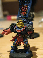
The Kantor model is one of the reasons I opted for a Crimson Fists force with a strong and dynamic pose the model has lots of detail and a great solid feel that epitomises the space marine look. An ornate metal model but without the overcrowded feel some metal models can develop where details become lost to flash or simply being too close together to adequetly pick out in detail. The colour scheme is dictated but spot colours and shading give great opportunity to customise and personalise the model.
Base colour - necron abyss lightened to Mordian blue in 3 stages of different mixes (a pallet is great for this, just progressivley add the lighter colour and reapply each time). The thinner the paint the better. Extreme highlights of mordian blue to shadow grey and white happen quickly on the edges to give the armor a slightly metalic look, especially on the pauldrons.
The head - base colour of Tau Sept Ochre drybrushed over with Deneb Stone. To tie the helmet back in with the rest of the model I washed it Asurmen Blue. I then reapplied the Deneb Stone as a highlight and finally skull white as an extreme edge.
The Laurels start as Darkangle green lightening to snot green on the tips. Again the snot green was mixed in progressivley larger amounts with Darkangles green and thinned. The key seemed to be the less paint on the brush the better the result.
Ropes and tabbards - base of Mechrite Red with another coat of Red Gore. Highlights where the light would catch the leather of Solar Orange and Blood Red mix. The mix was used essentially because the blood red when thinned wouldn't take to the model but the foundation paint really brought the colour out on the model. Final extreme highlight of Solar Orange. Very similar is the highlighting on the power fist.
Gems are red gore with a single line of blood red through the centre and a dot (as small as I could make it) of skull white). I find the best way to apply these fine details in holding the brush in one hand, elbow braced against your stomach holding the miniature in the other. This way if I shake at least both hands shake at the same time and rate (my old art teacher Mr Bannister taught me that).
The new technique and colour combination I tried was on the gold. I really don't like the metallic paints as I find they give too coarse an effect on small models and details unless mixed or watered down. the small particles also get everywhere and changing water every few minutes is a pain. The gold on Kantor should be more worn and weathered, ostentation giving way to practicality and pragmatism. The darker tones also work well with the reds and oranges. As a base I used Calthan brown and highlighted with Tausept Ochre. I could have left it here (first pic) but felt it lacked the characteristic lustre of even burnished gold so tried a minimal and extreme highlight of skull white and a watered down Golden yellow (pic 2). I prefer the second and feel I'm closer to achieving the look I'm after but still lack the depth of a true metallic surface, will have to find another model to practice on (I see the Grey Knights have lots of metallic surfaces and pendants...). See which you prefer and please let me know.
Just the banner and finishing off then he's ready to take to the field (or seal inside a container and burried in concrete for its protection).
Tuesday, 5 April 2011
Brushes
A workman should never blame his tools but a bad paintbrush can make your life a good deal more frustrating. Stray hairs and split bristles preventing accuracy or fibres that don't give up the paint to the surface evenly. I'm not an expert on the science of brush construction but I have tried a good number of different brushes and makes with varried results. Here is what I thought of a few makes and types.
These three brushes are the three I use more than any, The yellow is a medium size brush good for corse detail and fine detailing of large flat edges. The red is a fine detail brush with a good spring to it that has maintained its shape and is excellent for close work. They are both made by Daler-Rowney and are available at Hobbycraft and for those in the Birmingham area, usually at Spectrum http://www.spectrumfinearts.co.uk/ (though they haven't updated the website in a while that is where they are). All three are acrylic brushes which is great for the thicker Citadel paints though they have done well with even 1:1 water mixes and washes.
The silver brush is a small flat brush from Vallejo though the range seems to have been discontinued. It is a Pony hair brush and excellent for dry brushing though not for applying large amounts of paint as the bristles tend to clump up. The citadel dry brush is often in use as are a few ProArte brushes (they do a minatrue range) though these have a very short lifespan with citadel paints and don't apply the paint evenly all the time. This does however make them great for stippling effects though at £3.75 a brush they are one of the more expensive brushes to do this with.
These brushes have been used mainly for painting Kantor at the moment with a before shot on a previous blog and a work in progress below. The helmet gives a good example of how citadel paints, when not watered down, can leave small clumps of paint which give an organic look from a distance but a scruffy look up close.
Friday, 1 April 2011
Painting Desk
The never ending list of things to paint has been substantially expanded this month. 40k is still the mainstay with 4 Sternguard and Pedro Kantor on the list but they have been joined by models from a few other systems and sculpters.
Firestorm Armada from Spartan Games http://www.spartangames.co.uk/firestorm_armada.htm has been slowly expanding their range with some great additions. Don't let the home page put you off, there are some great models in this range and the Templar Heavy Cruiser is in dock for a paint job.
Next up are two models from the Infinity series. A range of sculpts are available with themes from modern Military to futuristic ninja and samurai (and the occasional anthropmorphic cat nurse, not their finest model) http://www.infinitythegame.com/infinity_ENG/
Sculpt quality is generally good but they will need some infilling with modelling putty to smoth lines prevent gaps.
Warmachine features next http://privateerpress.com/ (probably the best website with lots of information, painting tips and pics of the range) with a small Khador battleforce.
The jacks have a pleasingly solid and heavy look with a surprising amount of versatility to their pose and position (especially if your willing to make minor adjustments to the sculpt).
The metal minatures are generally excellent with some showing great dynamism and character, the fluid motion of the dog in mid leap is probably one of the best models I've seen in years (though some green stuff is needed to smooth out joins in places.
The model demanding immediate attention though is the Gamesworkshop metal miniature http://www.games-workshop.com/gws/ Pedro Kantor.
A great metal miniature easy to assemble with just flash needing clipping off (though the banner pole can be tricky just drill into the backpack a hole the width of the pole and glue to in place). Not as much of a centre piece model as other chapter masters Kantor has a solid apperance that suits placing him among several squads, leading from the middle.
Subscribe to:
Posts (Atom)